Mean or median: which should you report for skewed data?
When the mean and median disagree, which one tells the truth? Three quick NumPy experiments: skewed salaries, one extreme value, and two groups where the mean describes almost nobody. Tested with NumPy 2.5 and SciPy 1.18.
TL;DR — For skewed data, report the median when you want the “typical” value, and the mean when you need totals (budgets, payroll, total sales). In our test, 63% of people earned less than the mean salary, and one extreme value nearly doubled the mean while moving the median by 29. If the data has two groups, neither number is typical: look at the histogram.
Tested on 2026-10-06 with NumPy 2.5.3, SciPy 1.18.1, Matplotlib 3.11.2, Python 3.12.
Key points
- The mean is pulled by the tail. In right-skewed data (incomes, prices, response times) the mean sits above the median.
- The median ignores extreme values. One huge value can move the mean a lot and the median almost not at all.
- The mean is the right choice for totals. Total = mean × count. The median times the count gives the wrong total.
- A trimmed mean is a middle ground. It drops a fixed share of the smallest and largest values before averaging.
- With two groups, both can describe nobody. Only 2.3% of our two-group data was near the mean.
How far apart are the mean and median in skewed data?
Far enough to change the story. I generated 1,000 salaries from a lognormal distribution, a common shape for incomes, and compared the two numbers. I also added one CEO, checked a 10% trimmed mean, made a two-group dataset, and computed a payroll total.
import numpy as np
from scipy import stats

rng = np.random.default_rng(7)

# 1. Right-skewed data: 1,000 salaries
salaries = rng.lognormal(mean=np.log(50_000), sigma=0.6, size=1_000)
print(f"salaries     mean {salaries.mean():>9,.0f}  median {np.median(salaries):>9,.0f}")
print(f"share of people earning less than the mean: {(salaries < salaries.mean()).mean():.0%}")

# 2. One extreme value
with_ceo = np.append(salaries, 50_000_000)
print(f"+ one CEO    mean {with_ceo.mean():>9,.0f}  median {np.median(with_ceo):>9,.0f}")
print(f"+ one CEO    10% trimmed mean {stats.trim_mean(with_ceo, 0.1):,.0f}")

# 3. Two groups: who is "typical"?
two_groups = np.concatenate([rng.normal(35, 6, 500), rng.normal(70, 6, 500)])
m, med = two_groups.mean(), np.median(two_groups)
print(f"two groups   mean {m:.1f}  median {med:.1f}")
print(f"share within 5 of the mean: {(abs(two_groups - m) < 5).mean():.1%}")
print(f"share within 5 of 35:       {(abs(two_groups - 35) < 5).mean():.1%}")

# 4. When the mean is the right answer: totals
print(f"payroll = mean x n: {salaries.mean() * len(salaries):,.0f} vs sum {salaries.sum():,.0f}")
print(f"payroll from the median x n: {np.median(salaries) * len(salaries):,.0f}")
Output:
salaries     mean    56,165  median    48,005
share of people earning less than the mean: 63%
+ one CEO    mean   106,059  median    48,034
+ one CEO    10% trimmed mean 51,244
two groups   mean 52.5  median 53.0
share within 5 of the mean: 2.3%
share within 5 of 35:       28.1%
payroll = mean x n: 56,164,625 vs sum 56,164,625
payroll from the median x n: 48,004,851
The mean salary is 56,165 and the median is 48,005. Saying “the average person earns 56k” is misleading here: 63% of people earn less than that.
What does one extreme value do?
It nearly doubles the mean. Adding a single 50-million salary to 1,000 normal ones moved the mean from 56,165 to 106,059. The median moved from 48,005 to 48,034.
A 10% trimmed mean drops the lowest 10% and highest 10% before averaging. With the CEO included it gave 51,244. That is close to the median but still uses most of the data, which is why it is popular for noisy measurements.
What if the data has two groups?
Then neither number is “typical”. The two-group data has peaks near 35 and 70. Its mean (52.5) and median (53.0) land in the gap between them:
| Window | Share of the data |
|---|---|
| Within 5 of the mean (52.5) | 2.3% |
| Within 5 of the first peak (35) | 28.1% |
The chart shows both datasets with the mean and median marked:
import numpy as np
import matplotlib
matplotlib.use("Agg")
import matplotlib.pyplot as plt

# same data as above (same seed, same order of draws)
rng = np.random.default_rng(7)
salaries = rng.lognormal(mean=np.log(50_000), sigma=0.6, size=1_000)
two_groups = np.concatenate([rng.normal(35, 6, 500), rng.normal(70, 6, 500)])

plt.style.use("dark_background")
fig, axes = plt.subplots(1, 2, figsize=(12, 4))
panels = [(salaries / 1000, "Salaries (thousands)"), (two_groups, "Two groups")]
for ax, (x, title) in zip(axes, panels):
    ax.hist(x, bins=40, color="#5fa8d3", edgecolor="#1b1b1b")
    ax.axvline(x.mean(), color="#f4a261", lw=2.5, label=f"mean {x.mean():.1f}")
    ax.axvline(np.median(x), color="#e9edc9", lw=2.5, ls="--", label=f"median {np.median(x):.1f}")
    ax.set_title(title)
    ax.legend()
fig.tight_layout()
fig.savefig("mean_vs_median.png", dpi=100)
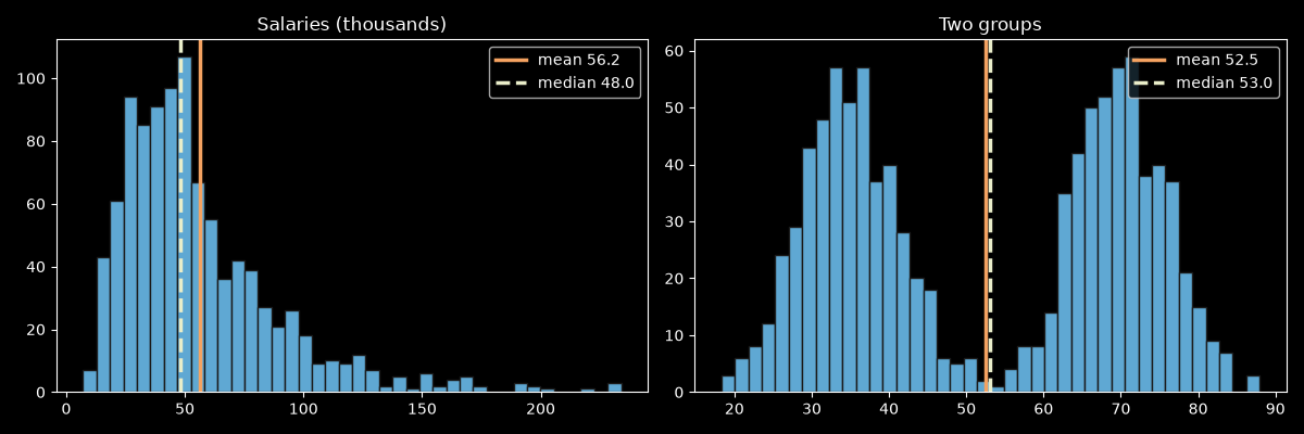
For data like this, report the groups separately, or show the histogram. A single summary number hides the most important fact: there are two kinds of values.
When is the mean the right answer?
When you need a total. Total payroll is the mean salary times the number of people: 56,164,625, exactly the sum. Using the median gives 48,004,851, which underestimates the budget by about 8.2 million.
| Question | Report |
|---|---|
| What does a typical person earn / pay / wait? | Median |
| How much will this cost in total? | Mean (or just the sum) |
| Noisy measurements with a few bad readings | Trimmed mean or median |
| Data with two or more groups | Split the groups, or show the histogram |
| Roughly symmetric data without outliers | Either. They are almost equal |
Common mistakes
- Reporting only the mean for incomes, prices or latencies. Report the median, and the mean if totals matter.
- Treating “mean > median” as proof of skew. It is a hint. Look at a histogram to see the actual shape.
- Dropping outliers to make the mean look right. If an extreme value is real, the median handles it without deleting data.
- Averaging across groups that should be separate. Two groups give a mean that describes neither.
Sources
numpy.median,scipy.stats.trim_mean— checked 2026-10-06
Related: What is a histogram? · How many bins should a histogram have?