Histogram vs KDE: how do you choose the bandwidth?

A KDE is a smooth histogram, and its bandwidth works like the bin width. Tested with SciPy: what Scott’s rule gets right, how a KDE leaks below zero, and when a histogram shows more.
TL;DR — Start with the default (Scott’s rule, bw_method="scott" in SciPy), then check it against a histogram. A bandwidth that is too small invents peaks; one that is too large merges real ones. Be careful with data that has a hard limit such as zero, and with narrow spikes: a default KDE handles both poorly.
Tested on 2026-09-28 with SciPy 1.18.1, NumPy 2.5.3, matplotlib 3.11.2, Python 3.12.
Key points
- A KDE (kernel density estimate) places a small bell curve on every data point and adds them up. The result is a smooth curve instead of bars.
- The bandwidth is the width of each bell curve. It plays the same role as the bin width in a histogram.
- Scott’s and Silverman’s rules are good starting points. On our two-peak data, both found exactly the two real peaks.
- KDEs spill over hard limits. On waiting times, which can’t be negative, the default KDE put 8.8% of its density below zero.
- KDEs flatten narrow spikes. A spike holding 10% of the data became a barely visible bump.
How does the bandwidth change a KDE?
We reuse the 1,000 delivery times from the bins post: a fast group around 30 minutes and a slow group around 45. The code counts how many peaks each bandwidth produces:
import numpy as np
from scipy.stats import gaussian_kde

rng = np.random.default_rng(7)
x = np.concatenate([rng.normal(30, 4, 600), rng.normal(45, 4, 400)])   # same data as the bins post

grid = np.linspace(10, 65, 1_101)
for bw in [0.05, "scott", "silverman", 0.8]:
    kde = gaussian_kde(x, bw_method=bw)
    density = kde(grid)
    peaks = grid[1:-1][(density[1:-1] > density[:-2]) & (density[1:-1] > density[2:])]
    print(f"bw_method={str(bw):<9} factor={kde.factor:.3f}  bandwidth={kde.factor * x.std(ddof=1):.2f} min"
          f"  peaks at {np.round(peaks, 1).tolist()}")
bw_method=0.05      factor=0.050  bandwidth=0.43 min  peaks at [17.0, 19.8, 26.0, 29.8, 35.8, 38.2, 41.4, 44.6, 47.7, 52.8]
bw_method=scott     factor=0.251  bandwidth=2.14 min  peaks at [29.6, 44.8]
bw_method=silverman factor=0.266  bandwidth=2.27 min  peaks at [29.6, 44.8]
bw_method=0.8       factor=0.800  bandwidth=6.82 min  peaks at [31.5]
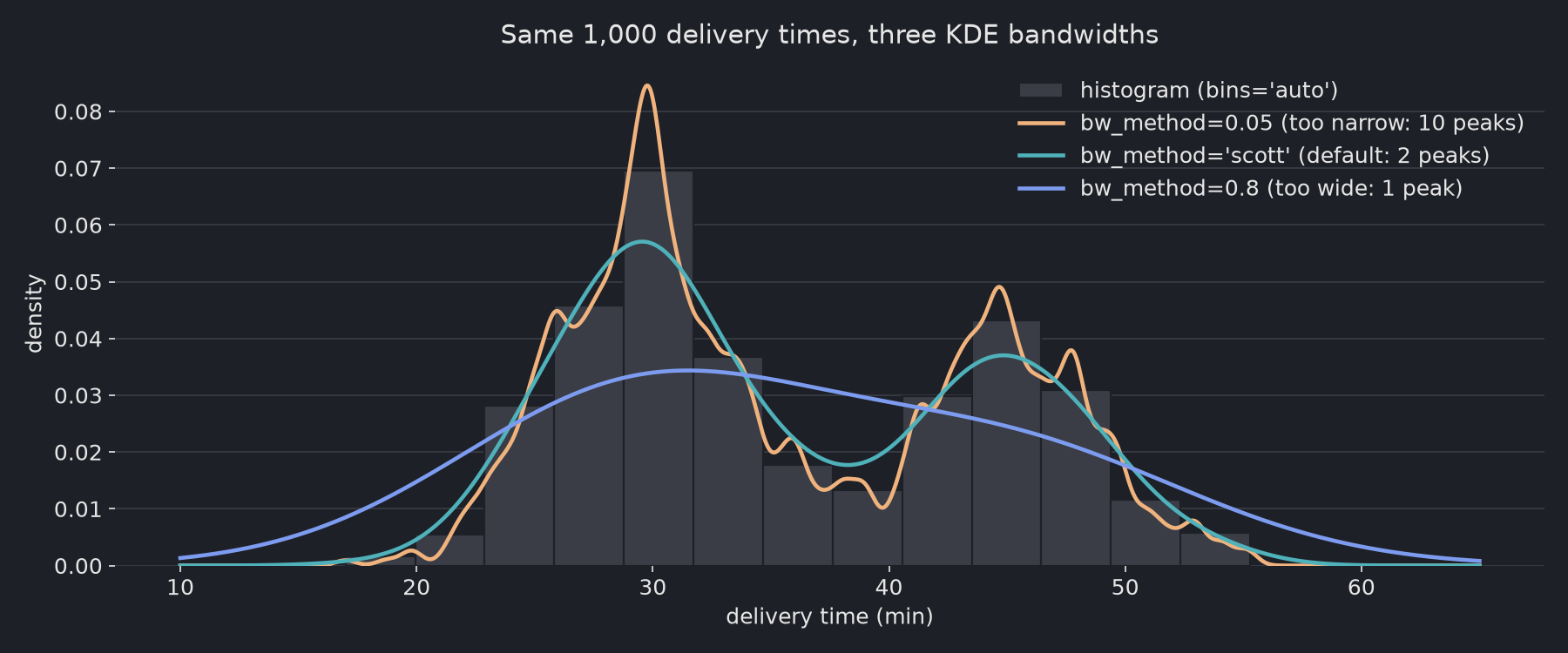
In SciPy, bw_method sets a factor that is multiplied by the data’s standard deviation. Scott’s factor is n^(-1/5), which is 0.251 for 1,000 points. That gives a bandwidth of 2.14 minutes here.
bw_method | Bandwidth | Peaks found | Verdict |
|---|---|---|---|
0.05 | 0.43 min | 10 | Too narrow: 8 of the peaks are noise |
"scott" (default) | 2.14 min | 2 (29.6, 44.8) | Matches the two real groups |
"silverman" | 2.27 min | 2 (29.6, 44.8) | Nearly the same as Scott |
0.8 | 6.82 min | 1 | Too wide: the two groups merge |
What goes wrong with data that can’t be negative?
The KDE puts bell curves on points near zero, and half of each curve lands below zero. Here are 1,000 exponential waiting times:
import numpy as np
from scipy.stats import gaussian_kde

rng = np.random.default_rng(1)
wait = rng.exponential(scale=5, size=1_000)          # waiting times: never below 0

kde = gaussian_kde(wait)                             # default bandwidth (Scott)
print(f"smallest observed value:         {wait.min():.3f}")
print(f"KDE probability mass below zero: {kde.integrate_box_1d(-np.inf, 0):.3f}")
smallest observed value:         0.013
KDE probability mass below zero: 0.088
No waiting time is negative, but 8.8% of the KDE’s area is. The curve is also too low just above zero, where the data is densest. For data with a hard limit (durations, prices, counts), a histogram is safer. Another option is to fit the KDE on np.log(wait) and read the result on the log scale.
Can a KDE hide a narrow spike?
It can flatten one. Here 90% of the values are spread widely around 50, and 10% sit in a tight spike at 70:
import numpy as np
from scipy.stats import gaussian_kde

rng = np.random.default_rng(3)
# 90% of values spread widely, 10% in a narrow spike at 70
x = np.concatenate([rng.normal(50, 15, 900), rng.normal(70, 0.5, 100)])

for bw in ["scott", 0.05]:
    kde = gaussian_kde(x, bw_method=bw)
    ratio = kde(70.0)[0] / kde(60.0)[0]
    print(f"KDE bw_method={str(bw):<6} density at 70 is {ratio:.2f}x the density at 60")

counts, edges = np.histogram(x, bins="auto")
i = np.searchsorted(edges, 70) - 1
print(f"histogram bins='auto': bar at 70 = {counts[i]}, bar at 60 = {counts[np.searchsorted(edges, 60) - 1]}")
KDE bw_method=scott  density at 70 is 1.05x the density at 60
KDE bw_method=0.05   density at 70 is 2.58x the density at 60
histogram bins='auto': bar at 70 = 148, bar at 60 = 101
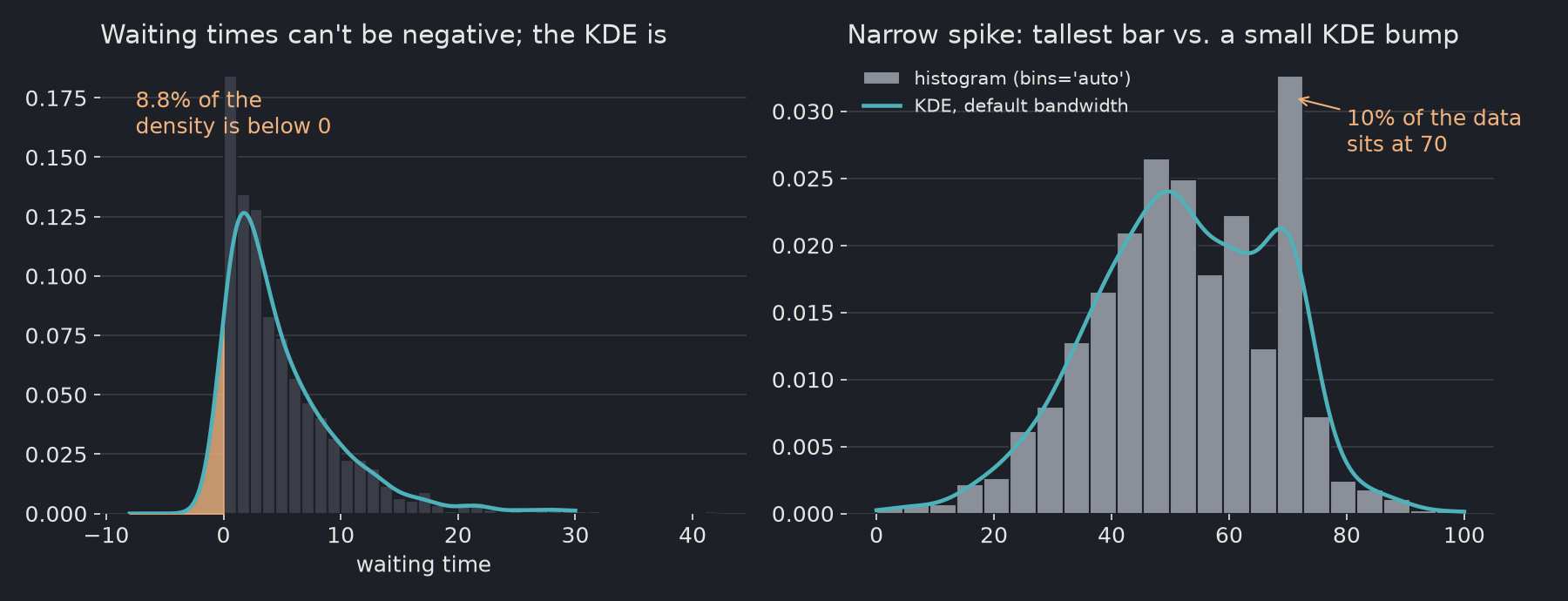
The default bandwidth is chosen for the whole dataset. Because most of the data is spread out, the bandwidth is wide, and the spike gets smeared. In the histogram, the bar at 70 is the tallest on the chart. In the default KDE, it is a bump only 5% above its surroundings.
When should you use a histogram, and when a KDE?
| Situation | Use |
|---|---|
| First look at a new variable | Histogram with bins="auto" |
| Comparing the shapes of several groups on one chart | KDE (curves overlap more cleanly than bars) |
| Data with a hard limit (≥ 0, 0–100%) | Histogram, or KDE on a transformed scale |
| Possible spikes, rounding, or repeated values | Histogram |
| Presentation after you have checked the histogram | KDE with the default bandwidth, overlaid on the histogram |
Sources
scipy.stats.gaussian_kde—bw_method, Scott’s and Silverman’s factors, SciPy docs, checked 2026-09-28
Related: How many bins should a histogram have? · What is a histogram?