How can you explore histograms and KDE interactively in Python?

A small pygame app to change bins and KDE bandwidth on the same sample and watch what happens. Three hands-on experiments: 5 vs 200 vs auto bins, bandwidth 0.05 vs Scott vs 0.8, and a KDE that leaks below zero on positive data.
TL;DR — Run the histogram-visualizer, a small Python desktop app, and change one setting at a time on the same sample. In the experiments below, the same 1,000 points went from 8 KDE peaks (bandwidth factor 0.05) to 2 (Scott) to 1 (0.8), and a KDE of strictly positive data put 8.8% of its area below zero.
Tested on 2026-10-08 with repository commit 515d859, Python 3.13.11, NumPy 2.4.1, SciPy 1.18.1 and pygame 2.6.1 on macOS. The repository’s 98 tests passed in that environment.
Key points
- It is a desktop app, not a web page. You need Python 3.10+ and three packages.
- Change one thing at a time. Every lesson keeps the same samples; don’t press Resample during an experiment.
- Bins change the bars, bandwidth changes the curve. Neither changes the data.
- A smooth curve is not automatically more accurate. Too much smoothing merged two real peaks into one.
- A KDE does not know your data can’t be negative. Smaller bandwidth reduced the leak below zero but did not remove it.
How do you run the visualizer?
git clone https://github.com/zayunsna/histogram-visualizer.git
cd histogram-visualizer
python3 -m venv .venv
source .venv/bin/activate          # Windows: .venv\Scripts\activate
python -m pip install -r requirements.txt
python -m histogram_visualizer
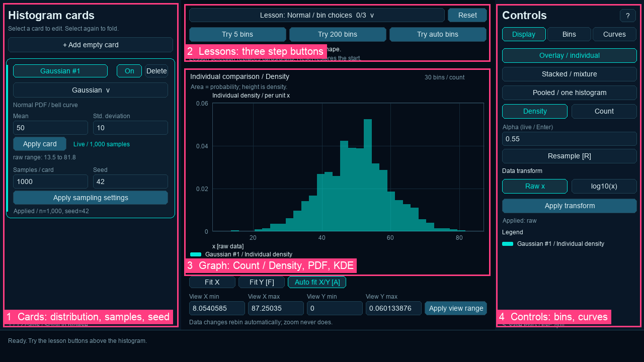
On macOS or Linux you can also open a lesson directly: ./run.sh --lesson bimodal. The window has four areas: cards (distribution, sample count, seed), lesson buttons, the graph, and controls (Display, Bins, Curves tabs). If you want the background first, the earlier posts cover what a histogram shows, how to choose bins and how KDE bandwidth works. This post is about seeing it happen.
What changes when you change the number of bins?
Question: are the bumps in a histogram the shape of the data, or the shape of the bins?
Do this: choose the lesson Two peaks / 600 + 400 (seed 7: 600 points from N(30, 4) and 400 from N(45, 4)). Click Try 5 bins, then Try 200 bins. For auto, open the Bins tab, pick auto and click Apply bins / all samples.
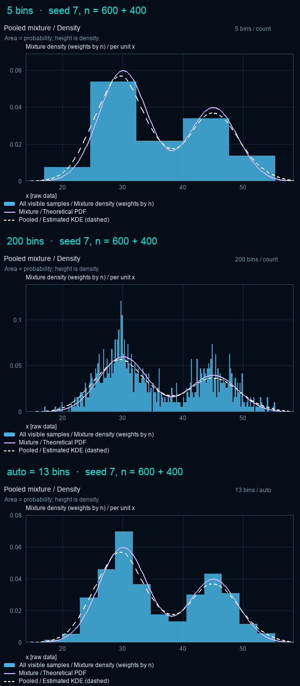
Look at: the solid purple line (the theoretical density) against the bars.
What it tells you:
- 5 bins: you can still tell there are two groups, but the bin edges decide where the peaks seem to be.
- 200 bins: each bin holds only a few points, so bars jump up and down. Some reach about 0.12, twice the true peak. That is noise, not structure.
- auto (13 bins here): the bars follow the curve. In this environment
autogave 13 bins. Other NumPy versions can give a different number, so check what your run says above the graph.
What you can’t conclude: that 13 is “the right number”. It is a reasonable choice for 1,000 points of this shape.
What changes when you change the KDE bandwidth?
Question: a KDE gives a smooth curve. Is smoother better?
Do this: stay on the same lesson and the same sample. In the Curves tab, set the bandwidth to a numeric factor 0.05 and press Enter, then choose Scott, then click the lesson button KDE factor 0.8.
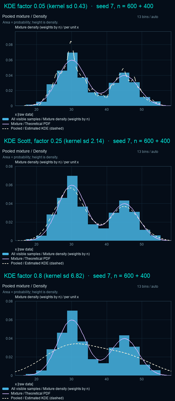
Look at: the dashed white line (the KDE) against the solid purple line (the true density).
| Bandwidth | Kernel standard deviation | Local peaks in the KDE |
|---|---|---|
| factor 0.05 | 0.43 | 8 |
| Scott (factor 0.25) | 2.14 | 2 |
| factor 0.8 | 6.82 | 1 |
(Peaks counted as local maxima higher than 5% of the curve’s maximum. The KDE post counts every local maximum and finds 10 at factor 0.05; the two extra are tiny bumps in the tails, at 1% and 3% of the highest peak.)
What it tells you: the numeric value is SciPy’s factor; the kernel’s actual width is factor × sample standard deviation. At 0.05 the curve invents bumps that aren’t in the true density. At 0.8 it hides a valley that is real. Scott’s rule happened to land between them on this sample. It is a starting point, not a guarantee.
Why does the KDE extend below zero?
Question: if every data point is positive, can the KDE still put probability on negative values?
Do this: choose the lesson Exponential / boundary bias (seed 1, 1,000 points, scale 5). Click Compare PDF + KDE, then View negative x, then KDE factor 0.05.
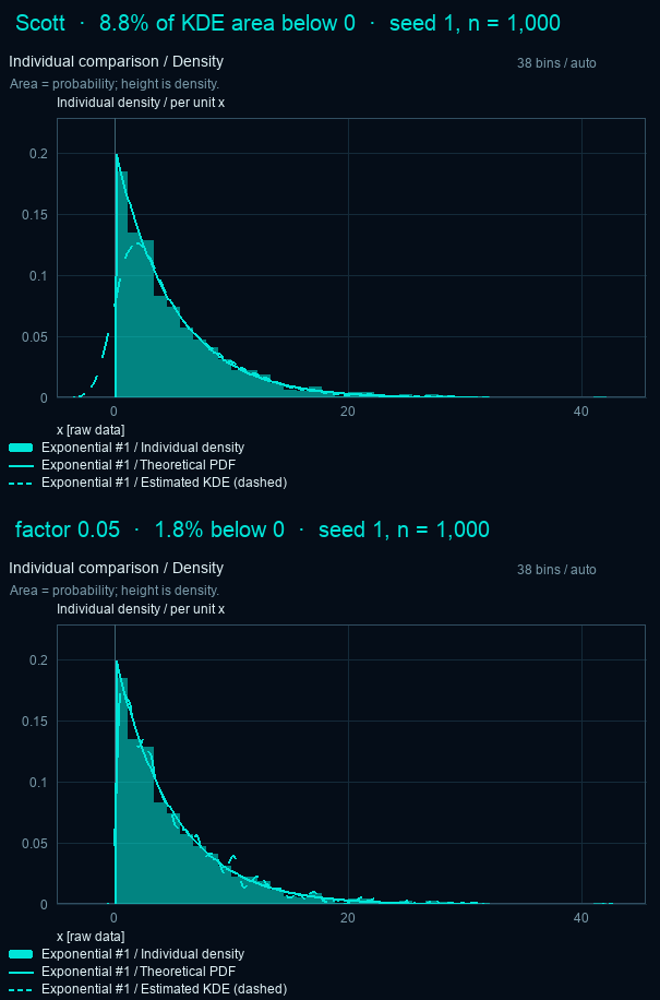
Look at: the region left of x = 0. The solid theoretical curve stops at zero. The dashed KDE doesn’t.
| Bandwidth | KDE area below zero | Shape |
|---|---|---|
| Scott | 8.8% | smooth, but misses the sharp start at 0 |
| factor 0.05 | 1.8% | jagged, 9 local peaks |
What it tells you: each point gets a Gaussian bump, and bumps near zero spill over it. A smaller bandwidth shrinks the spill but makes the rest of the curve noisy. The app shows this on purpose: it does not clip or renormalize the KDE. For bounded data, consider plotting log(x), or use a method built for boundaries.
Which parts of the code should you explore?
You don’t need to read all of it. These five pieces are where you’d change things:
| Code | What it does | Change it to… |
|---|---|---|
build_lesson() in lessons.py | Builds each lesson’s samples from a fixed seed | add your own lesson |
Model.rebin() in model.py | Recomputes bin edges and keeps the samples | try other bin rules |
Model.histograms() in model.py | Turns counts into Count or Density for each view | see how density is normalized |
KDECache in kde.py | Runs SciPy’s gaussian_kde in the background and caches results | change the evaluation grid |
references() in curves.py | Draws the theoretical curve for the chosen distribution | compare against another reference |
Common mistakes
- Treating the KDE as the true distribution. The solid line is the theoretical PDF; the dashed line is an estimate from your sample.
- Reading Density bar height as probability. In Density mode, area is probability. With narrow bins a bar can be taller than 1.
- Confusing zoom with rebinning. Changing the view range only moves the window. Rebinning recomputes the bins.
- Thinking
log10(x)is a log axis. In this app it transforms the data itself, then rebins. - Pressing Resample mid-experiment. Then you are comparing two different samples, not two settings.
Try two more experiments
- Log-normal / raw vs log10: switch to
log10(x)and watch a long right tail turn roughly symmetric. Switching back to Raw restores the exact same samples. - Narrow spike / smoothing: 100 of 1,000 points sit in a narrow spike near 70. Compare 200 bins, KDE 0.05 and Scott, and see which settings hide it.
Related: Histogram vs KDE: how do you choose the bandwidth? · How many bins should a histogram have?